Hotel Reservation & Revenue Dashboard
Microsoft Fabric | Power BI Development | Multi-Channel Booking Analytics
01The challenge
A hotel operation was taking reservations across multiple channels, corporate accounts, direct bookings, walk-ins, and third-party platforms like Booking.com and Expedia, but had no unified way to see how those channels actually performed against each other. Leadership couldn't easily tell which channels were driving real revenue versus which ones were quietly bleeding money through cancellations, and there was no seasonal or day-of-week visibility into booking patterns to guide staffing or pricing decisions.
02The data problem
Booking records came in from each channel separately, direct bookings, corporate reservations, walk-ins, and exports from third-party platforms like Expedia and Booking.com, each structured differently with no shared reservation ID logic or consistent revenue categorization. There was no way to compare net revenue against lost revenue by channel, no month-over-month or year-over-year baseline, and no consolidated view of cancellations against reservations over time. This all had to be unified before any reliable analysis was possible.
03My approach
I built a Data Factory pipeline in Microsoft Fabric to pull booking data from each channel source into a Fabric Lakehouse as a central staging layer, rather than working off disconnected exports. From there, I used Dataflows Gen2 and SQL in the Fabric Warehouse to reconcile the channel-specific formatting differences, standardizing reservation status, payment method, and revenue fields so every booking, regardless of source, could be compared on equal footing.
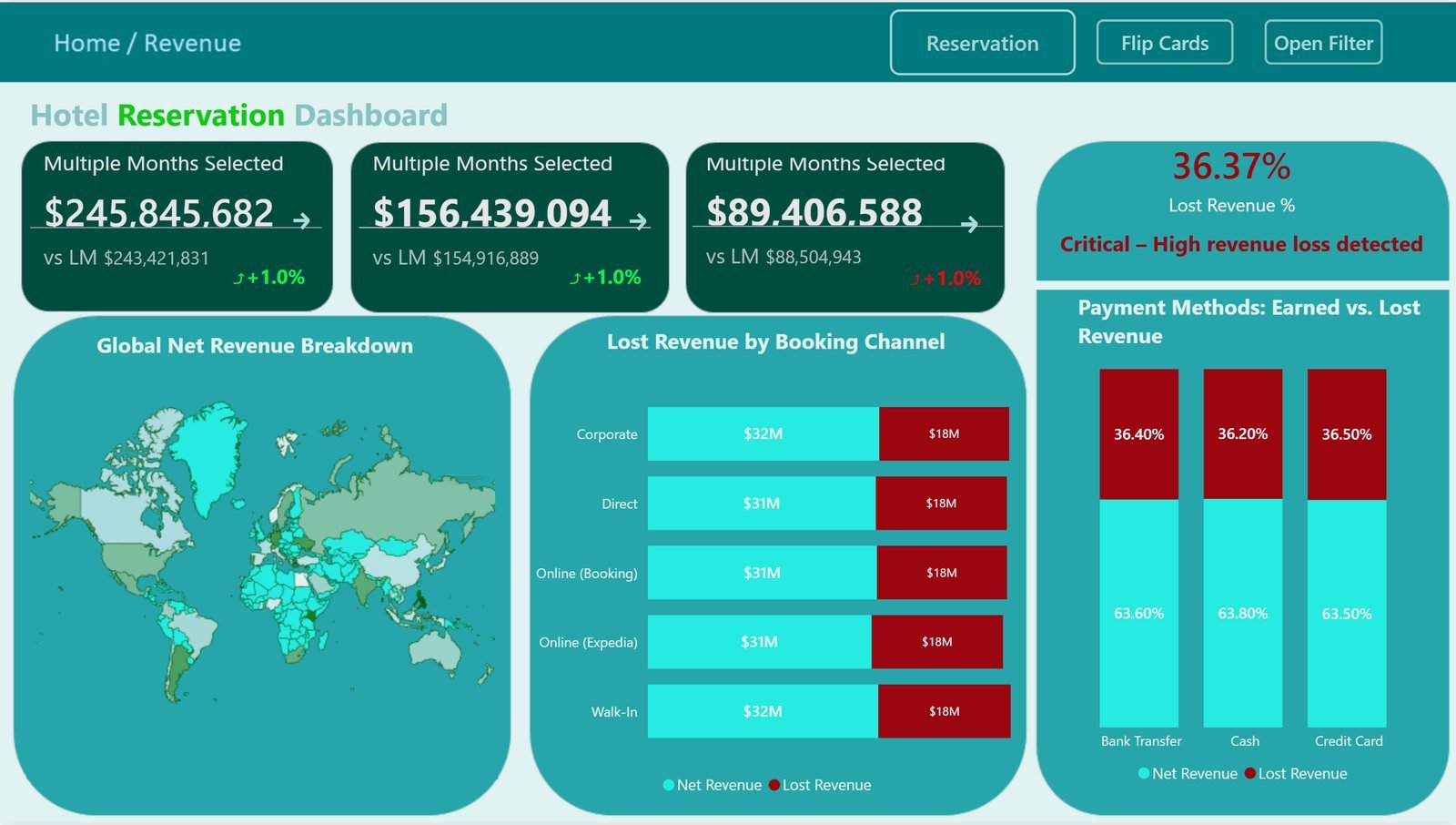
Once the data was clean, I modeled it into a star schema in the Warehouse and connected Power BI natively for reporting. I built out dedicated Reservation and Revenue views: the Reservation page tracks total bookings against cancellations by year and season, surfaces the highest volume and highest cancellation months, and includes a day-of-week heatmap table so patterns like which weekdays see the heaviest cancellations are immediately visible. The Revenue page breaks down net versus lost revenue by booking channel and payment method, with a world map visual showing where global revenue is concentrated.
For the KPI cards on the Revenue page, I built a flip-card interaction using Power BI bookmarks and selection-based navigation, letting users toggle a single card between its absolute value and its period-over-period change without needing a separate visual for each. I also built a DAX-driven alert logic that flags lost revenue percentage as critical once it crosses a defined threshold, so the "36.37% Lost Revenue, Critical" flag isn't a static label, it's a live calculation that would change color and message if performance improved.
04The result
Leadership got a single live view across every booking channel for the first time. The dashboard exposed that lost revenue was sitting at a critical 36% across nearly every channel and payment method, a consistent enough pattern to point at a systemic cancellation issue rather than a channel-specific one. It also surfaced that December and November were both the highest booking months and the highest cancellation months, the exact same period carrying the most upside and the most risk, giving management a clear, time-bound window to focus retention efforts.
Tools & tech stack
- Microsoft Fabric Data Factory: used to build a pipeline pulling booking data from multiple channel sources (direct, corporate, walk-in, and third-party platforms) into a central Lakehouse
- Fabric Lakehouse: staging layer for raw multi-channel booking data before transformation
- Dataflows Gen2 & T-SQL (Fabric Warehouse): used to standardize inconsistent formatting and reservation logic across booking channels
- Power BI Desktop & DAX: used to build the semantic model, LM/LY comparison measures, and threshold-based alert logic for lost revenue
- Power BI Bookmarks & Selection Actions: used to build the interactive flip-card KPI visuals
- Conditional Formatting: applied to the day-of-week heatmap table for pattern visibility
- Geospatial Visualization: world map for global net revenue breakdown by country
Have data that isn't telling you anything yet?
Send me what you are working with — even if it is four spreadsheets and a CRM export that don't agree with each other.