Critical Care & ER Analytics Dashboard
Power BI Development | SQL Integration | Healthcare Operations Analytics
01The challenge
An emergency department had no consolidated way to monitor patient flow, wait times, or admission patterns across time. Staff could see daily activity in isolation, but there was no way to answer questions like which hours saw the heaviest patient load, whether wait time targets were actually being met, or how admission rates broke down by age, gender, or referring department. Operational decisions around staffing and scheduling were being made without a real data foundation.
02The data problem
Patient records existed in two disconnected places: an Excel export covering registration-level detail (patient demographics, admission status, wait times, department referrals) and a separate SQL Server database holding related operational records. Neither source alone gave a full picture, and there was no shared structure between them to support time-based analysis like day-of-week or hour-of-day patient volume, or month-over-month trending.
03My approach
I pulled the SQL Server data and combined it with the Excel export in Power Query, aligning patient records across both sources into a single consistent model. This meant resolving overlapping fields, standardizing date and time formatting so hourly and daily patterns could actually be calculated, and building out proper categorical groupings for age brackets, admission status, and department referral that weren't consistently structured in the raw data.
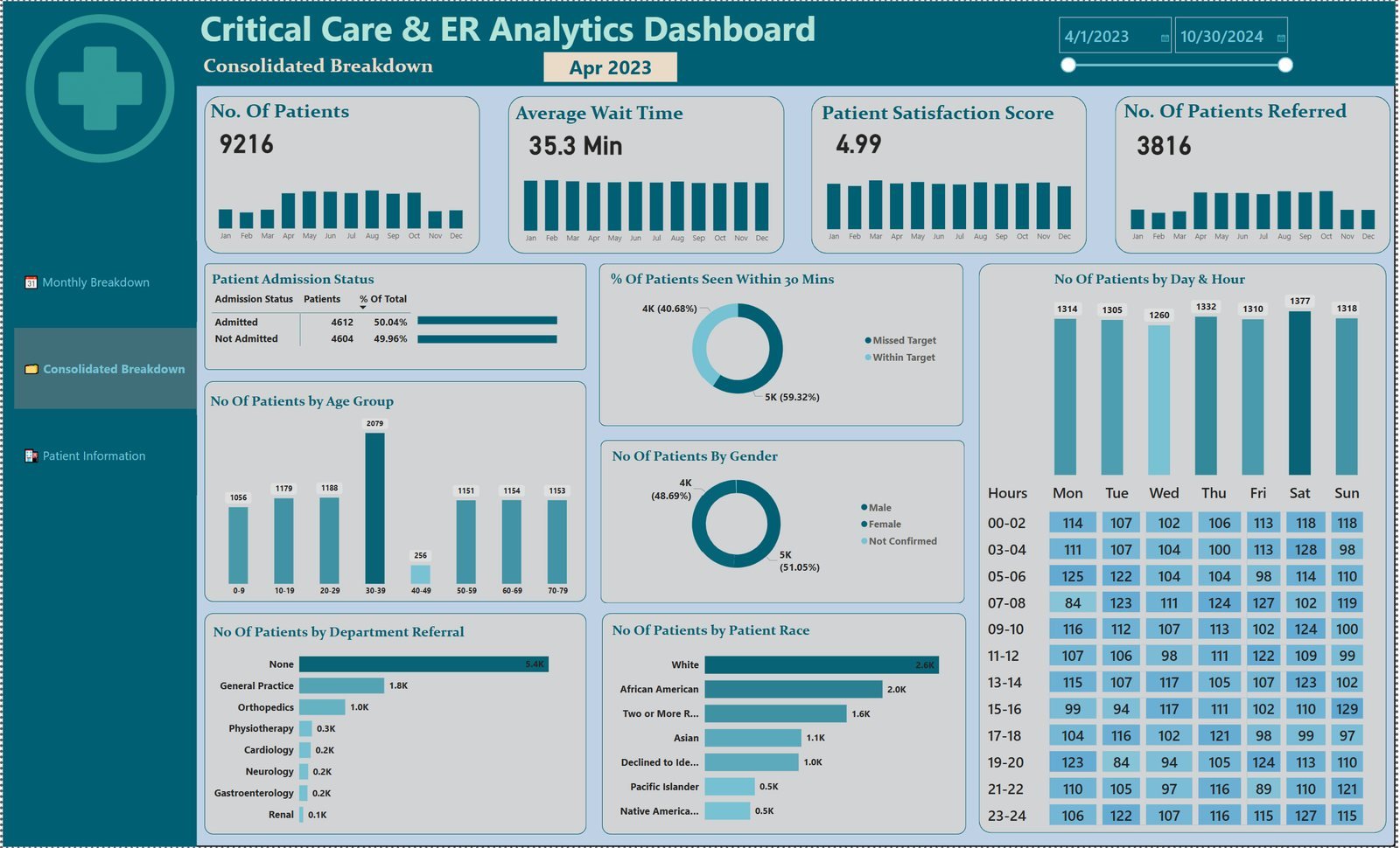
Once unified, I modeled the data to support three distinct views built around how ER staff and administrators actually need to use it: a Consolidated Breakdown page for the full historical view across admission status, age, gender, race, and department referral, a Monthly Breakdown page using sparkline-style trend visuals so a single month's daily fluctuation in patient volume, wait time, and satisfaction score could be scanned at a glance, and a Patient Information page as a searchable, filterable record-level table for operational or audit lookups.
The day-and-hour heatmap table was the most technically involved piece, I built DAX measures to aggregate patient counts into two-hour blocks across each day of the week, then applied conditional formatting so staffing-relevant patterns (like Saturday's 1,377 patients or spikes in early morning hours) are visible immediately without reading raw numbers. I also built a wait-time-target measure calculating the percentage of patients seen within a 30-minute benchmark, split out as its own tracked KPI rather than buried inside average wait time alone, since an average can hide how often the target is actually being missed.
04The result
The finished dashboard gave ER leadership a live, unified view across previously siloed systems. It surfaced that only 40.68% of patients were being seen within the 30-minute target despite a reasonable average wait time of 35.3 minutes, showing that the average was masking a meaningful share of patients waiting well past the benchmark. It also identified Saturday as the highest patient volume day and the 30–39 age group as the largest single patient segment by a wide margin, both directly useful for staffing and resource planning.
Tools & tech stack
- SQL Server: source for operational patient records, queried and pulled alongside the Excel dataset
- Power Query (M): used to combine and reconcile the Excel export with SQL Server data into a single consistent patient model
- Power BI Desktop & DAX: used to build wait-time-target calculations, time-based aggregations (day/hour heatmap), and trend measures across the Monthly and Consolidated views
- Conditional Formatting: applied to the day-and-hour patient volume table for pattern visibility
- Data Structure: unified patient-level model combining demographic, admission, and referral fields across both sources
Have data that isn't telling you anything yet?
Send me what you are working with — even if it is four spreadsheets and a CRM export that don't agree with each other.